Let’s face it: your bathroom should be more than a place where you brush your teeth and pray your eyeliner doesn’t smudge—it should be a whole vibe. And what better way to vibe it up than by channeling the soothing, minimalist magic of wabi-sabi? This ancient Japanese aesthetic says, “Hey, life isn’t perfect, and neither is your bathroom, but that’s where the beauty lies.”
And if you’re wondering who’s been sprinkling this vibe like fairy dust in the design world, meet Axel Vervoordt. This Belgian designer and wabi-sabi wizard has turned imperfection into perfection with his iconic works, like the zen-tastic penthouse at the Greenwich Hotel in New York. Inspired by his mastery, we’re here to help you transform your bathroom into the chill, serene sanctuary you deserve.
So, grab a cup of matcha (or wine, we’re not judging), and let’s dive into the ultimate wabi-sabi color palette guide to make your bathroom look expensive, feel peaceful, and stay practical.
What is Wabi-Sabi Anyway?
Think of wabi-sabi as that effortlessly cool friend who rocks messy buns and thrifted outfits but somehow always looks like a Vogue spread. It’s all about finding beauty in imperfection, keeping it simple, and embracing natural elements. Wabi-sabi in bathroom design means earthy tones, organic textures, and a vibe that whispers, “Take a deep breath—you’re home now.”
- Natural Materials:
Wabi-sabi favors organic, raw, and weathered materials like wood, stone, clay, linen, and wool. These materials often feature natural imperfections such as knots in wood, cracks in stone, or uneven textures. - Imperfection and Incompleteness:
The design welcomes asymmetry, irregularity, and handmade craftsmanship. Objects with visible flaws or signs of aging (like patina or wear) are appreciated for their uniqueness and character. - Earthy and Muted Tones:
The color palette is inspired by nature—soft, muted, and earthy shades such as beige, taupe, stone gray, and deep greens, creating a calm and grounded atmosphere. - Minimalism and Simplicity:
Spaces are uncluttered and intentionally sparse, allowing each object to have meaning and presence. Wabi-sabi encourages mindful consumption and values quality over quantity. - Organic Shapes and Forms:
Furniture and decor often feature soft, flowing, and irregular shapes that mimic natural forms rather than strict geometric designs. - Transience and Aging:
The design honors the passage of time, allowing materials to age gracefully. Worn textures, rust, tarnish, and weathered finishes are seen as beautiful reminders of life’s impermanence. - Connection with Nature:
Wabi-sabi integrates natural elements, such as plants, stones, and water features, creating a harmonious relationship between indoor spaces and the natural world. - Quiet and Serenity:
The atmosphere in Wabi-sabi spaces is serene, calm, and introspective, encouraging mindfulness and reflection.

1. Muted Earthy Tones
Inspiration: Clay, terracotta, and sand dunes on a breezy day.
Palette: Taupe, dusty ochre, warm terracotta.
How to Use It: Limewash a wall or two for that raw, textured look. Pair it with a rustic wooden vanity, and boom—your bathroom just became a Pinterest board.
Offfflow Tip: Not ready to commit to limewash? Try earthy-toned accessories like soap dispensers, trays, or even candles. Small touches can pack a big punch.

2. Subtle Stone Grays
Inspiration: River rocks that have seen some stuff.
Palette: Ash gray, pebble gray, soft charcoal.
How to Use It: Perfect for flooring or a stone basin that screams understated luxury. Want a softer touch? Opt for gray ceramic tiles with a matte finish.
Offfflow Tip: Balance those grays with warm lighting and a fluffy beige bath mat. Grays should be zen, not hospital vibes.
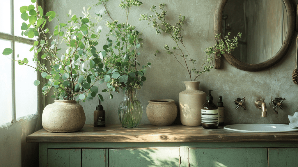
3. Natural Greens
Inspiration: Moss on stones, sage leaves, and forest air.
Palette: Sage green, eucalyptus, olive tones.
How to Use It: Add muted greens to your bathroom through plants (real or faux—no shame) or cabinetry painted in sage. It’s like inviting a forest to hang out in your shower.
Offfflow Tip: If you’re feeling fancy, grab some handmade pottery in green tones to store your toothbrushes or cotton pads. It’s functional art!

4. Warm Neutrals and Beiges
Inspiration: Linen sheets on a Sunday morning.
Palette: Chalky whites, sandy beige, soft cream.
How to Use It: Use these shades for walls, towels, or even shower curtains. They’re like the “whisper” of colors—calm, unassuming, and timeless.
Offfflow Tip: Layer textures! A waffle-knit bath towel here, a woven jute basket there. These little details make a neutral palette feel rich and cozy.

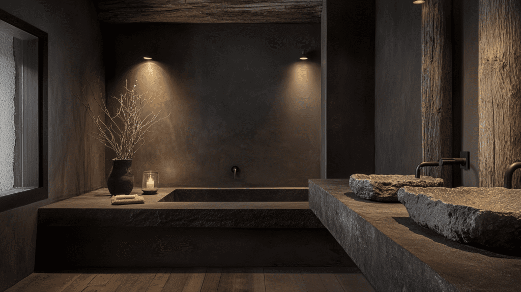
5. Deep Brown and Black Accents
Inspiration: Charred wood, aged metals, that espresso shot you needed this morning.
Palette: Espresso, charcoal black, rusty umber.
How to Use It: Think black fixtures, deep brown wooden shelving, or small decor pieces that anchor your space.
Offfflow Tip: Keep it subtle. Too much black and brown can feel heavy. Stick to accents like faucet fixtures or a single statement mirror frame.
How to Pull It All Together
1. Start with a Neutral Base
Begin by choosing a neutral palette for your walls, such as limewash in taupe or matte beige, to create a calming foundation. Flooring in polished concrete or stone tiles adds subtle texture, while wooden elements like a vanity or shelving bring warmth. This neutral base sets the stage for layering natural tones and materials.
2. Add Earthy Layers and Texture
Incorporate warm earthy tones like terracotta, taupe, and sage green through towels, rugs, and decor. Introduce texture with handcrafted ceramics, uneven tiles, and natural textiles like linen or waffle-knit towels. A wooden stool or woven basket can add a rustic charm while keeping the design functional and grounded.
3. Ground It with Contrast and Natural Touches
Anchor the look with subtle black or deep brown accents in fixtures, mirror frames, or accessories. Bring in natural elements like leafy green plants, a vase of dried pampas grass, or a bowl of smooth pebbles. Finally, enhance the space with warm, diffused lighting and personal touches like artisanal decor or a framed print. The key is to embrace simplicity, function, and the beauty of imperfection for a truly wabi-sabi feel.
Why Wabi-Sabi is Perfect for Your Bathroom
A bathroom isn’t just a functional space—it’s a sanctuary for self-care and quiet moments. Wabi-sabi design transforms your bathroom into a place where you can escape the chaos of daily life and reconnect with simplicity and mindfulness. With its earthy tones, natural materials, and understated elegance, wabi-sabi creates an environment that feels soothing and timeless.
Unlike fleeting trends, wabi-sabi is about authenticity and longevity. It encourages you to work with what you have, embrace imperfections, and invest in pieces that bring you joy. Whether it’s a handmade ceramic vase or a wooden vanity with a weathered finish, wabi-sabi brings meaning and purpose to your space.
By adopting this philosophy, your bathroom becomes more than a retreat—it’s a reflection of a lifestyle that values peace, balance, and the beauty of imperfection. And in a world that moves too fast, isn’t that exactly what we all need?
More to Read
If you’re inspired by the soothing simplicity and natural elegance showcased here, dive deeper into these must-reads for your design journey:
- Wabi-sabi Bathroom Designs
- Wabi-sabi Bathroom Sinks
- Wabi-sabi Bathroom Lightings
- Wabi-sabi Floor Lightings
- Wabi-sabi Pendant Lightings
- Wabi-sabi Bathroom Wall Decors
- Wabi-sabi Bathroom Potteries
- Wabi-sabi Mirrors
- Wabi-sabi Showers
- Wabi-sabi Color Palettes
Transform your bathroom into a harmonious sanctuary that blends style and functionality. Happy designing!